HEWI MAG / Knowledge
Architecture colour concept : The positive effects of colours
It is impossible to imagine our environment without colours. They constantly surround us. So what positive effects does an appealing colour scheme in architecture have on people? Find out more in this article.
The famous architect Le Corbusier highlighted the importance of colours in architecture when he said: "Colour in architecture is just as powerful a tool as the layout and the form."
Colours are an important element in architecture that have a significant influence on the effect of a building. This is why it is obligatory for planners and architects to pay special attention to the colour scheme of rooms and outdoor facilities. Using colour concepts in architecture makes perfect sense. After all, colours serve as mood enhancers and have been proven to have various effects on the human senses.
Healing Architecture: How architecture contributes to healing
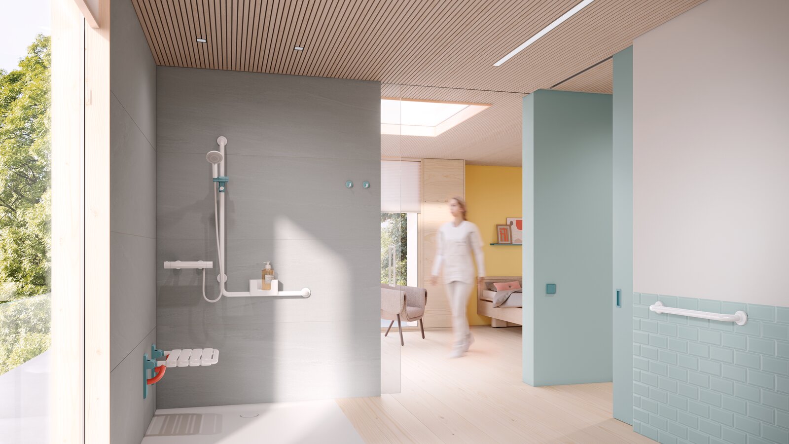
The colour design of hospitals or care facilities has positive effects on the recovery process and the well-being of patients and residents. It promotes a homely atmosphere and has a positive influence on health, mood and mental well-being. Visitors also tend to stay longer in facilities if they are colourfully designed and radiate a feel-good atmosphere.
Healing architecture has therefore long since arrived as an architectural concept in the planning of buildings. Colours are an important design element to achieve this. When it comes to the central criteria of a hospital or care facility, it is not only patient care that plays a significant role in the healing architecture, but also the environment and equipment. A growing number of international studies investigating the influence of physical spaces on interaction and behaviour and physical and psychological well-being support this theory of Healing Architecture.
Positive Learning: How architecture promotes learning
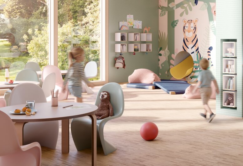
In addition to people who are ill or physically impaired, children also benefit from an appealing colour scheme. Colours have a particular impact on the learning effect in rooms where young people are being taught. It is important to create a positive environment that provides focus and space for creativity. Positive learning, child-friendly architecture and inclusion are pillars for sustainable educational concepts that offer benefits for all children.
The fundamental needs of children are safety and security. Schools and nurseries should encourage these feelings. Since children perceive spaces differently than adults, it is important for architects to think carefully about colour schemes.
Cheerful and bright colours are ideal for putting children in a positive mood in which it is easy to learn. However, the colour scheme of a room also depends on the age of the children who primarily spend time there and should be adapted to their respective needs.
With the help of colour concepts in architecture, it is possible to visualise important areas of a room even for the youngest children by highlighting products with colour accents. For example, it is possible to use a colourful door handle to playfully show children where the functional area on a door is.
Be iconic. Be colourful.
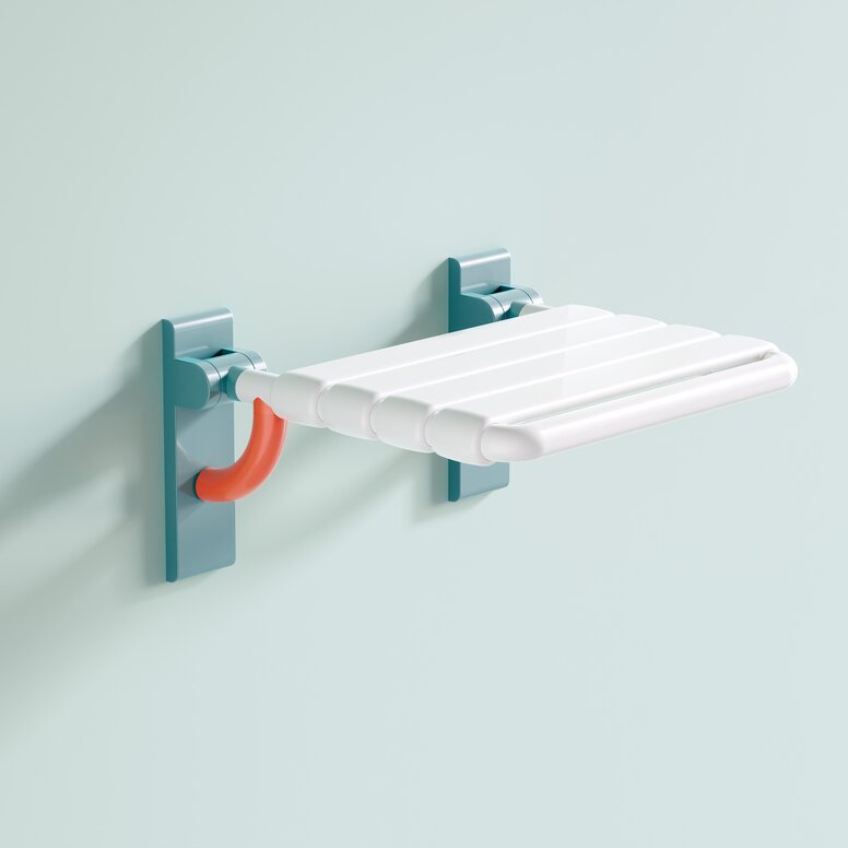
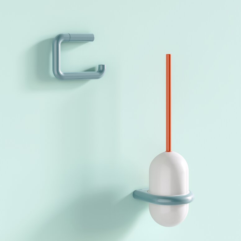
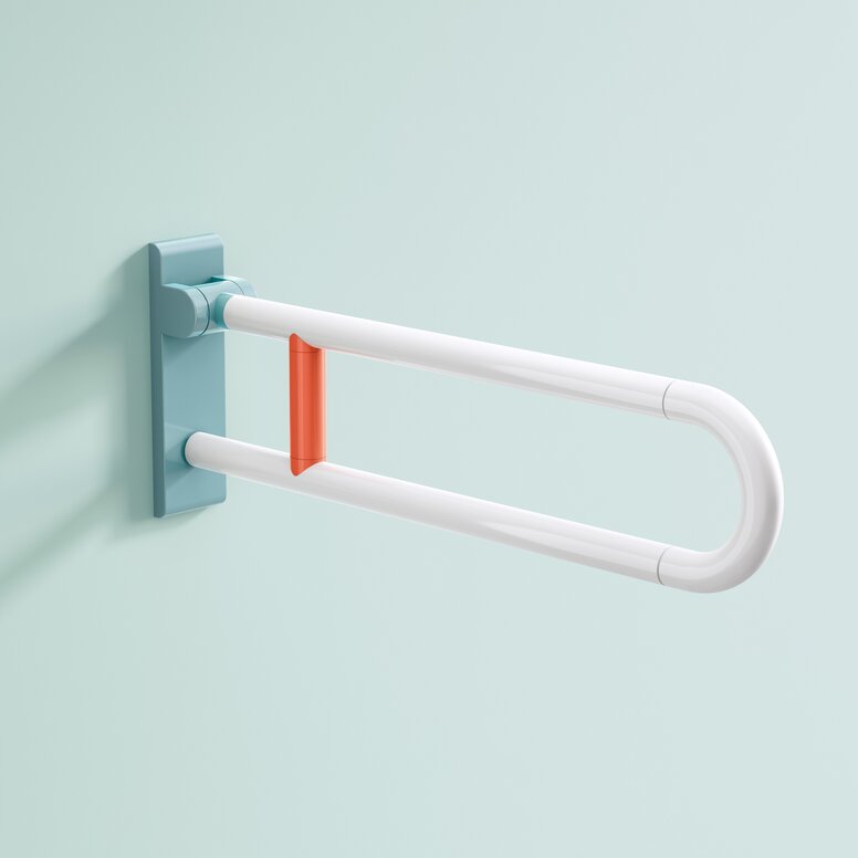
Series 477/801 from HEWI is a true classic that has been relaunched with exciting colour combinations: Series 477/801 ICONIC brings emotion and colour to architecture. The concept of the reinterpreted design icon is: Be iconic. Be colourful. With the targeted use of colour, the newly designed products in the series influence the sense of well-being in a room. Along with other colour designs in the room, they promote recovery processes and convey a feeling of security. As such, they create a relaxing and stress-free environment in harmony with other colour accents.
Be healing
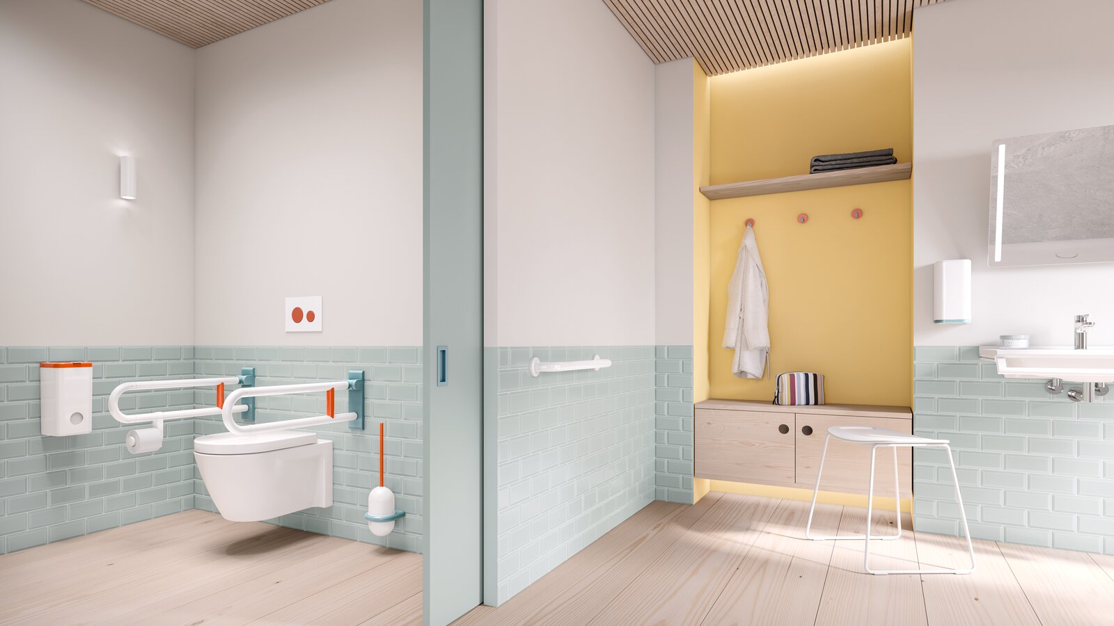
The colour combination coral, aqua blue and pure white is very suitable for use in healthcare buildings. The combination of coral and aqua blue is reminiscent of warm, tropical climates with beaches and crystal clear water. The base of warm colours makes coral simultaneously revitalising and relaxing. In combination with white and aqua blue, the colour concept appears enveloping and calming and transports people to a place of relaxation. The concept of healing architecture was, among other things, groundbreaking for the design of ICONIC products for healthcare buildings.
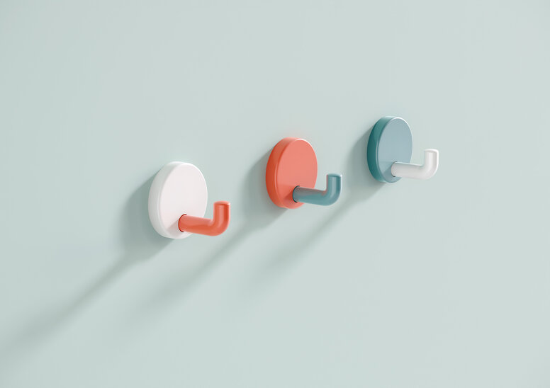
Series 477/801 ICONIC from HEWI expertly sets the tone. It signals the use and functionality of the products. This is especially important when people can no longer see without restrictions. Colour-accentuated products help users to find their way around better.
Be childish
Two different colour combinations of HEWI Series 477/801 are available for nursery and primary school furnishings. With the natural-looking shades of apple green, May green, coral and aqua blue as well as steel blue, HEWI offers two design options that make schools, nurseries or day care centres more appealing.
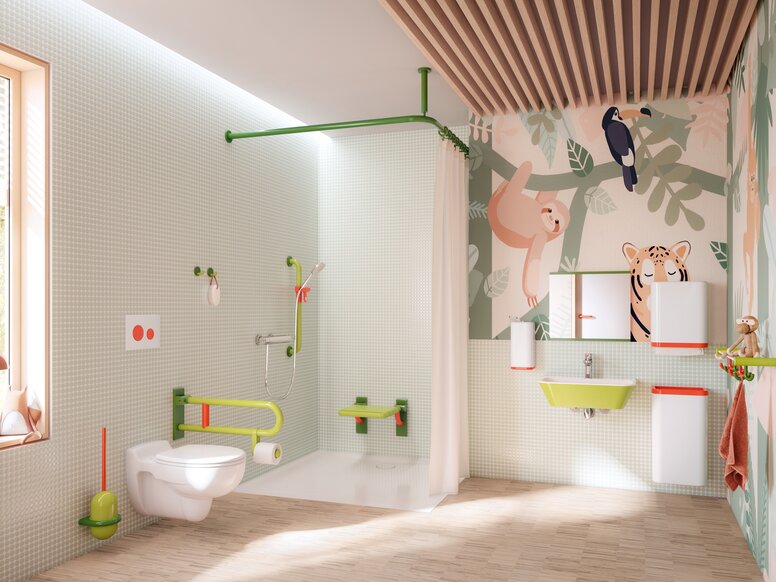
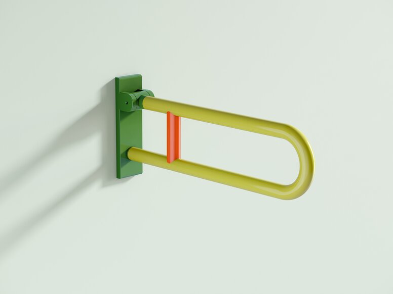
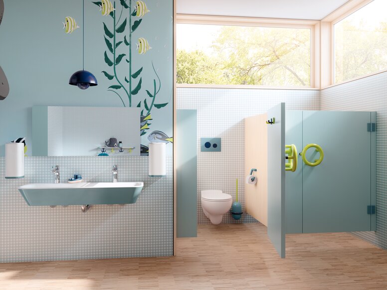
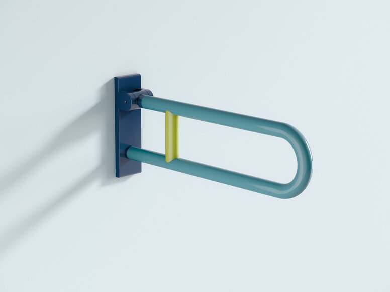
Bright, light shades of green have a relaxing effect. The proximity to nature gives off a feeling of vibrancy. The combination with the warm coral shade is particularly harmonious. Clear, serene shades of blue, on the other hand, promote concentration and have a calming effect. The colourful proximity to the sea radiates serenity.
Targeted use of colourful contrasts makes it easier for children to find their way around and enables intuitive use. The functional elements of the ICONIC Series 477/801 are highlighted to illustrate their function.
The products of Series 477/801 ICONIC harmonise with the HEWI single washbasins and dispenser systems. This guarantees a uniform appearance.
